Introduction to Magazine cover conventions
1) List the three most important magazine cover conventions in your opinion and explain why for each one. The three most important magazine cover conventions, in my opinion, are a title of publication, central image, and the cover line. Title of publication is important because it tells the audience what the magazine will be about or based on. The central image is important because it makes the audience focus on the image and tells them the ethos (identity) of the magazine. The cover line is important because the text placed around the image tells the reader/consumer what is going to be in the magazine (stories).
2) Identify as many of the magazine cover conventions as you can and write a list of where they appear on this cover of Closer. In the Closer magazine cover, sans is used to show it is a modern magazine, unlike a posh magazine which uses a serif.
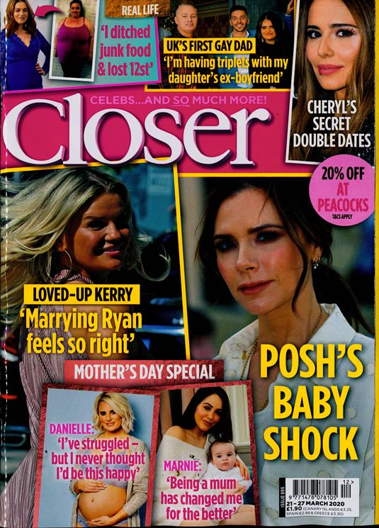
- Unlike a serif magazine Closer uses a variety of images with Sell Line around the whole magazine cover which tells what stories/contents that will be in Closer magazine.
- There is a slogan in the Closer magazine so it sums up the magazine and sticks in the consumer's mind it is right above the tittle "Celebs...and so much more!"
- There is also a free offer on the magazine "20% of at Peacocks" which is for the target audience which most likely likes celebrity gossip and shopping for clothes and makup.
- The colour scheme for the Closer magazine is yellow pink and blue because it stands out which may attract the reader. These colours connote a fun vibe.
- There is a lot of direct address used in the magazine to not waste the readers time and let them know what the magazine will mainly be about.
- The language used is short and snappy to maybe help the reader feel more intimate with the magazine.
- At the bottom right corner of the Closer magazine, it uses a barcode.
Comments
Post a Comment